About the
Project
Donation Redesign for Welthungerhilfe
Welthungerhilfe runs one of Germany's most-used charitable donation flows. The organization depends entirely on private contributions to fund long-term development work in over 35 countries. The brief was focused: redesign the donation frequency toggle to make recurring giving the more visible choice, without crossing into dark patterns. This case documents the design decisions and the thinking behind them.
Credits:
Project type
Client Work
Role
Working Student
Year
2025
Where
@ StudioGOOD
The Problem
The existing form treated one-time and monthly donations as equal choices: two radio buttons, identical visual weight, no hierarchy. That's a design decision that costs money. Not dramatically, not obviously, but consistently. When two options look the same, users default to the one that feels like less of a commitment.

The original toggle: two options, no hierarchy
The existing form treated one-time and monthly donations as equal choices: two radio buttons, identical visual weight, no hierarchy. That's a design decision that costs money. Not dramatically, not obviously, but consistently. When two options look the same, users default to the one that feels like less of a commitment.
Design Decisions
I replaced the radio buttons with an animated toggle. The monthly option gets a red active state, a short supporting label ("Schafft nachhaltige Veränderung durch regelmäßige Hilfe") and an animated icon that appears on selection. Three things working together: color creates hierarchy, copy explains why the option matters, motion confirms the choice feels deliberate.

Before: radio buttons. After: weighted toggle with active state
The animation appears only when monthly is selected. It draws attention without interrupting, a quiet signal that this option is the more impactful one.
When monthly is selected, an animated icon appears alongside the supporting label. Motion confirms the choice without demanding attention.
To make the new toggle feel like it belonged, I updated the surrounding elements too, donation amount buttons and the purpose dropdown. Changing one component and leaving the rest untouched creates visual inconsistency that undermines trust. A donation form needs to feel considered end to end.

Updated donation amount buttons for visual consistency. Changing one element and leaving the rest untouched creates inconsistency that undermines trust.
The Ethical Question
The design clearly favors one option. I thought about this deliberately. There is a line between guiding users toward a better outcome and manipulating them into something they didn't want. Crossed, that line is called a dark pattern. The toggle doesn't hide the one-time option, doesn't make it harder to select, and doesn't use false urgency or deceptive framing. It applies weight, not pressure. Given WHH's mission, nudging users toward greater long-term impact is something I'm comfortable defending — and something I'd push back on if the brief had asked for anything more aggressive.
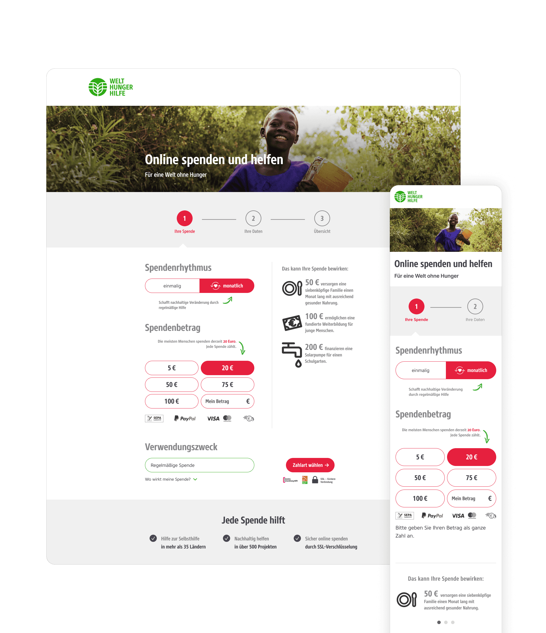
Redesigned form in full context
Outcome
A more contemporary, emotionally considered donation experience that works within WHH's existing design system. The interface now does some of the persuasion work itself, not by tricking users, but by making the better option feel like the obvious one.