MacOS DB App
MacOS DB App


Overview
Overview
Overview
In this UI design-centered student project, I worked on the implementation of a native MacOS App. An iOS App was to serve as the basis, which I was allowed to choose myself.
In order to approach the topic of MacOS design guidelines, I looked at the past of desktop operating systems. Here I looked at Apple as well as Windows and NeXTSTEP interfaces and took a critical look at them. Of course, I also looked at the interfaces of the present in this project and analyzed them as well.
Implementation
Implementation
Implementation
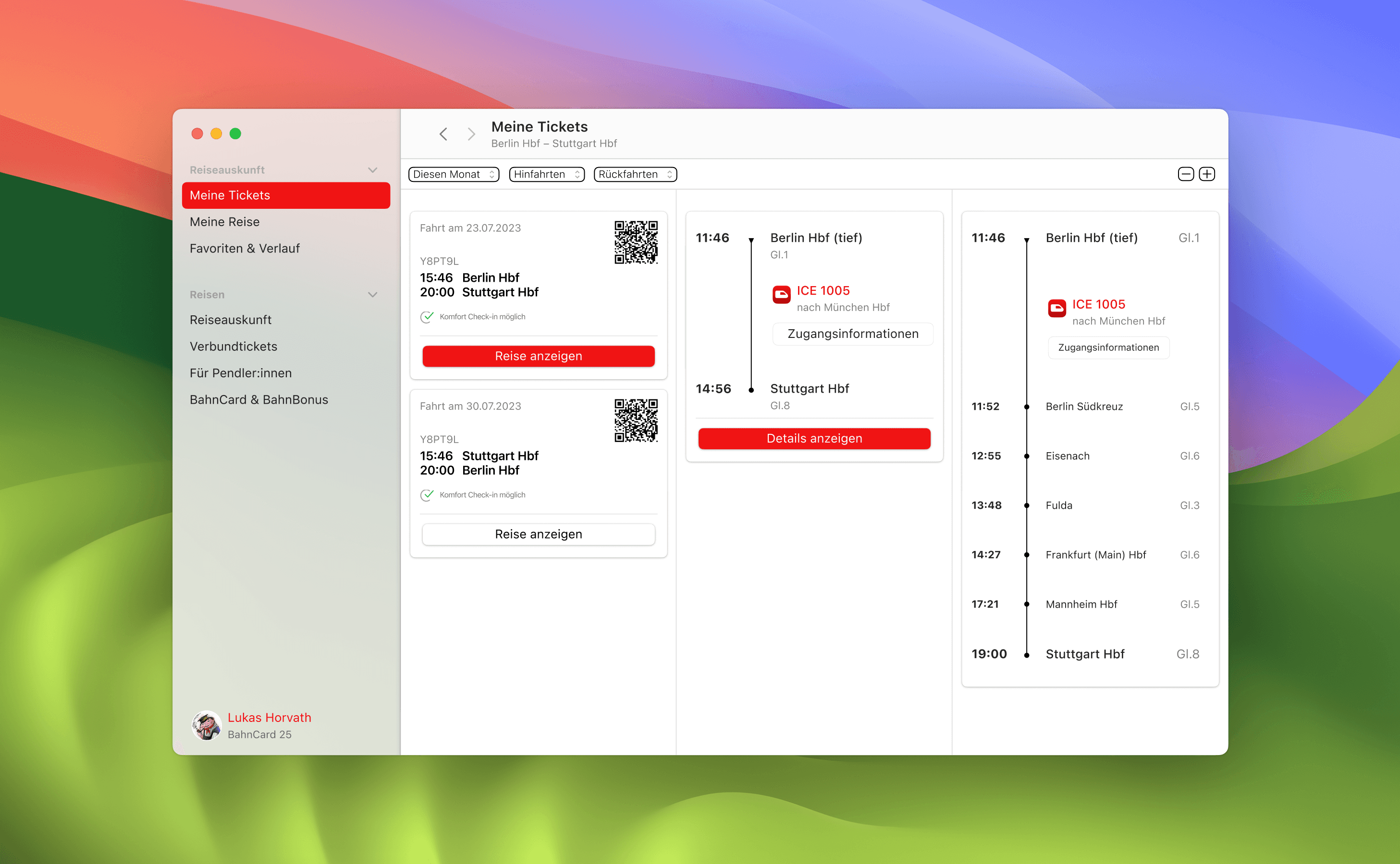
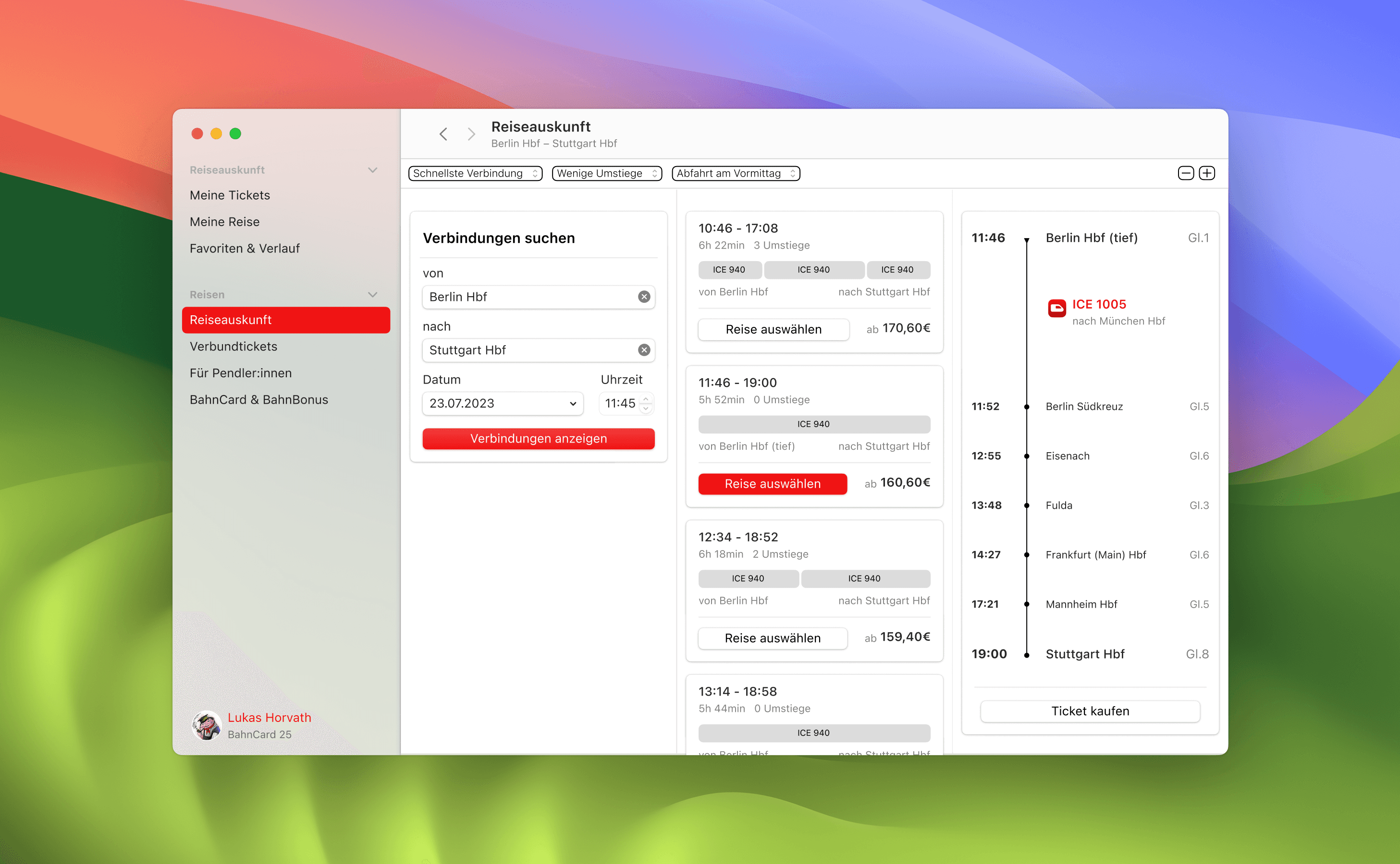
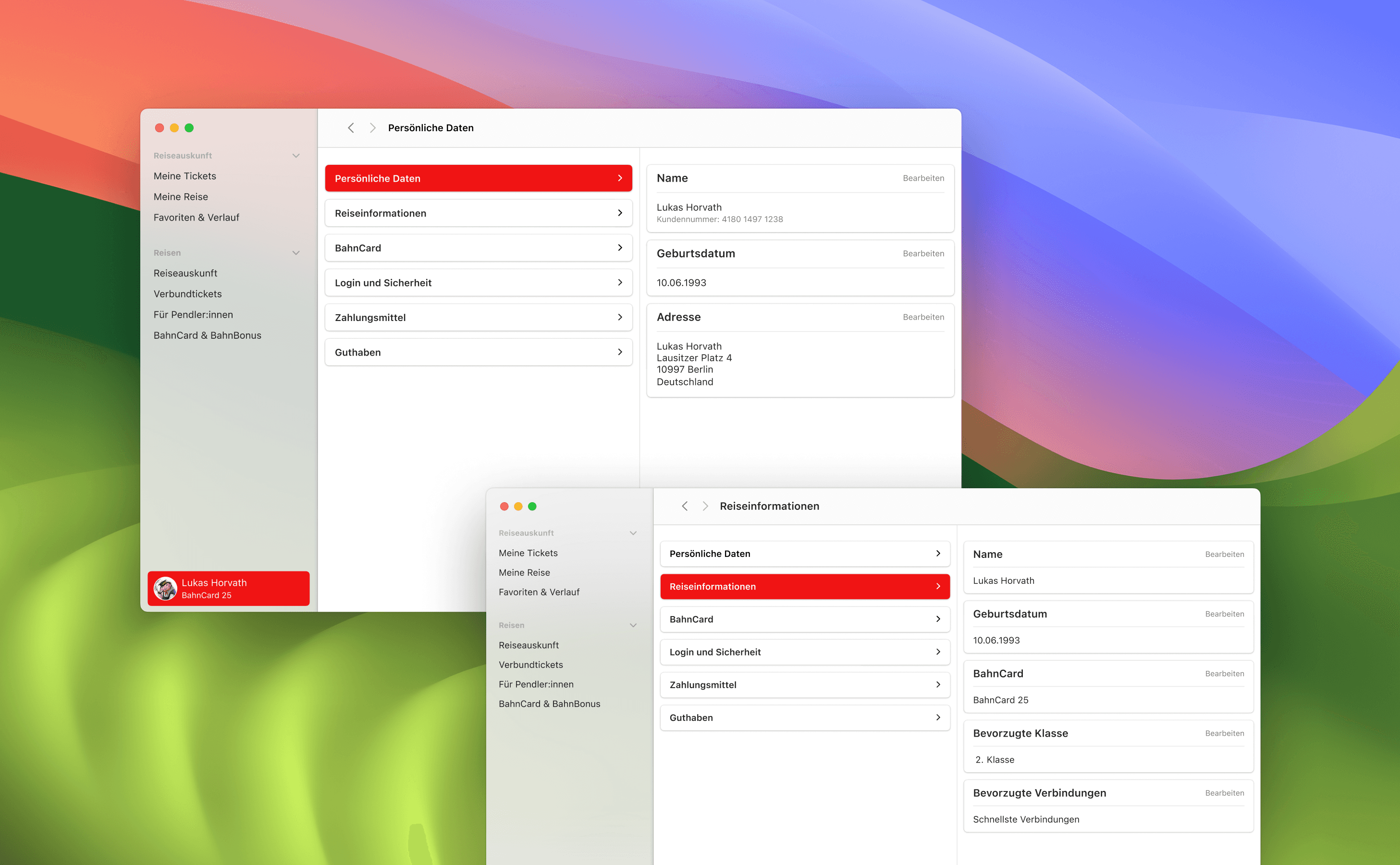
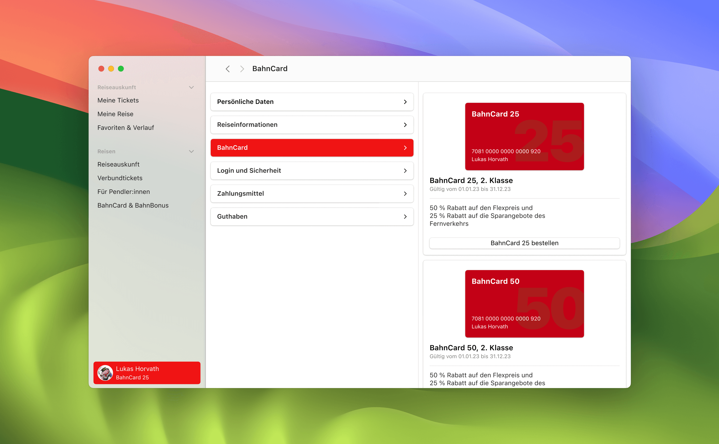
For my implementation of a MacOS-compliant App, I chose the DB (Deutsche Bahn) iOS App as the basis. This App has many requirements, such as connection search, travel information, ticket management and many other UI elements. These requirements always result in a new structure of information and interaction options. This made it appealing for me to bring the app into a coherent MacOS system. In my design, I concentrated on the travel information view, ticket management and the user profile.
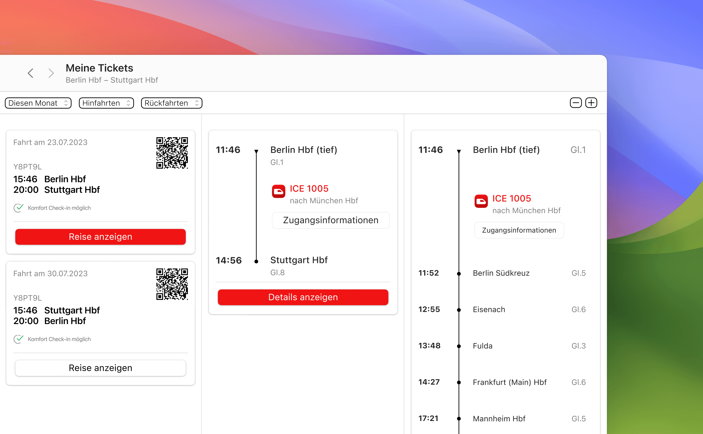
Since desktop Apps mainly display information horizontally, I decided to use columns similar to the ones you are used to in the MacOS Finder. By arranging the columns, I was able to display the various steps that had to be taken on the screens in a left-to-right sequence. This means you can always follow every step. With each further interaction, a new column is then displayed with the corresponding content and interaction options.
Conclusion
Conclusion
Conclusion
This project gave me my first experience of designing desktop apps. I was able to gain valuable knowledge about designing for MacOS and desktop operating systems in general. I was also taught to take a critical look at the latest versions of operating systems.
This project gave me my first experience of designing desktop apps. I was able to gain valuable knowledge about designing for MacOS and desktop operating systems in general. I was also taught to take a critical look at the latest versions of operating systems.
