Mamma Mia Pizzeria
Brand Design
Mamma Mia Pizzeria
Brand Design


Overview
Overview
Overview
I recently completed a freelance project, which involved creating a logo and a pizza box design for a pizza brand called "Mamma Mia Pizzeria". The goal was to develop a brand identity that was playful and approachable, while also being memorable and visually engaging.
For the logo, I used simple lines that curved in a circular pattern to create an abstract representation of a pizza. The use of circles and curves helped to convey a sense of motion and dynamic, while the overall design was intended to be friendly and approachable. To reinforce the brand's identity as a pizzeria, I selected colors that were reminiscent of the hues found in actual pizza, such as deep reds, greens, and beiges.
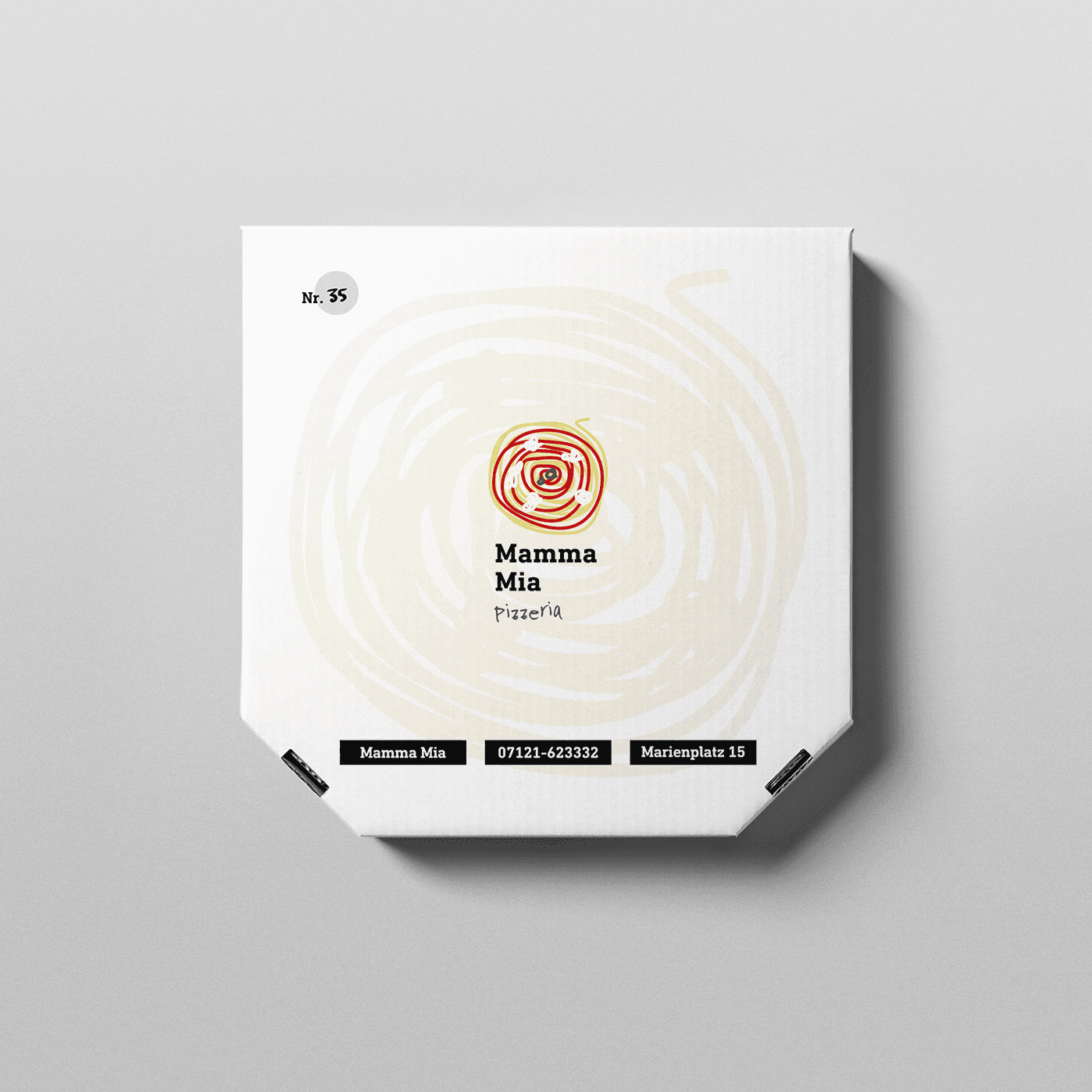
then I applied the same design principles to the pizza box, creating a cohesive and visually appealing packaging solution for the brand. The design featured the same circular motif as the logo, along with playful typography and graphics that emphasize the brand's personality and approachability. The color palette was also carried over to the pizza box design, helping to create a strong sense of brand continuity and recognition.
One of the challenges of this project was creating a design that stood out in a crowded marketplace while still being faithful to the brand's core identity. To overcome this challenge, I focused on creating a design that was bold and distinctive, yet still approachable and playful. By emphasizing the brand's identity as a pizzeria and using bright colors and bold typography, I was able to create a design that effectively captured the brand's personality and values.
